
Digital experiences built on a foundation of clarity.
Framixa operates at the intersection of visual identity and technical execution. We design for the Prague context and the global web.
Comparison Matrix: Legacy vs. Optimized
*These are real constraints from a Prague-based B2B software client. The trade-off: standard design patterns vs. a custom, accessible system.


The Prague Blueprint: A Visual Manifesto
Our philosophy is rooted in a simple, austere truth: a design system must first be a system. Before it can be beautiful, it must be functional. We don't decorate; we structure.
Clarity Over Decoration
We map the user's task first. Every element must justify its existence on the screen. A cluttered interface is a failure of thinking, not a lack of visual polish. Our grid system acts as an invisible scaffold, ensuring consistency across breakpoints.
Method Note: We evaluate robustness by attempting to remove components. If the interface fails without it, it's essential. If it remains intact, it's decoration.
Structure as Narrative
A website has a beginning, a middle, and an end. We choreograph the user's journey through size, weight, and negative space. The visual flow is not an accident; it's the story we're telling.
"We guide the eye. We don't fill space. Every scroll is a step in a deliberate narrative."
— Lead Designer, Framixa

Decision Lens: Animation
- → Optimizes for: User feedback, state changes, micro-guidance.
- → Sacrifices: Occasional older browser performance, development time.
- → Never for: Atmosphere or decoration. Every movement must convey information.
The Craft in Motion
Our process is a documented series of artifacts. We don't hide our methodology; we share it. This is how we move from a client's brief to a launch-ready product.
Glossary: How We Define "Robust"
- Resilient Layout
- A layout that holds its structure without breaking, even when unexpected content (like a long German title) is introduced.
- Maintainable Code
- A codebase a client's internal team can understand and extend without needing to hire the original author.
- Forward-Compatible
- A system that doesn't rely on bleeding-edge browser features that may be deprecated in 18 months.
Discovery & Strategy

Key insight from workshop:
"Users need status at a glance."
We prioritize this in the IA.
Visual System Design
Component Criteria:
- → Contrast > 4.5:1
- → Touch target ≥ 44px
- → Font size ≥ 16px
- → Focus states clear
Pitfall: Skipping focus states for keyboard users.
Development Handoff
Figma Constraints:
"We treat the handoff file as a living spec, not a static export."
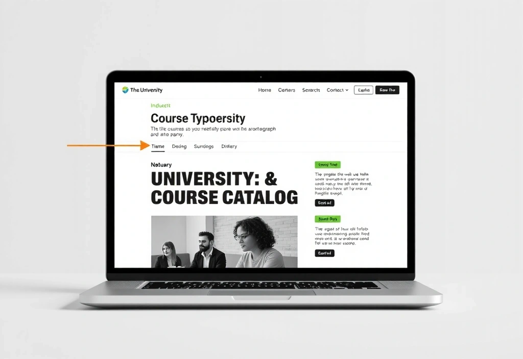
Client: PRAGUE ART INSTITUTE
A legacy educational site with a 7-second load time and a navigation system that obscured course offerings from international students.
The solution was to rebuild the information architecture from the ground up, prioritizing discoverability over visual density. We implemented a global, sticky navigation and a performance-optimized image delivery pipeline.
The Framixa Standard
A checklist for digital excellence. These are the non-negotiables we apply to every project, informed by real-world constraints and trade-offs.
Performance
Goal: Lighthouse > 90A fast site retains users. We optimize Core Web Vitals from the start.
Realism: Timeline pressure often forces compression of assets. We budget for optimization time.
Accessibility
WCAG 2.1 AACompliance isn't optional. We test with screen readers and keyboard navigation.
Constraint: Legacy content often requires costly remediation. We scope this explicitly.
Responsiveness
320px → 4KFluid layouts that adapt, not just collapse. Content prioritization is key on mobile.
Trade-off: Complex desktop designs may need simplification for mobile.
Maintainability
Clean CodeWe document our work. The goal is handoff to your team, not dependency.
Decision Criteria: Choosing a CMS your team can actually use.
GDPR/EU Law
Czech ComplianceCookie consent, data handling, and hosting within EU data centers are baseline.
Scenario: A Prague-based cafe needs a site that works in both Czech and English.
Integration
API-ReadyArchitecture anticipates future needs: e-commerce, booking, or custom APIs.
What changes our mind: A client's specific technical requirement (e.g., SAP integration).
Ready to start a project?
We work with a limited number of clients each year to ensure depth and quality. If you have a real business problem and a timeline, let's talk.
Available Mon-Fri: 9:00-18:00 · Call: +420 222 313 445